Logos & Marks
Some of the most fun creative work happens in the margins. This section gathers logos, illustrations, and collateral I’ve designed. Pieces that may be small in scope but carry the same design intention as my larger brand work.
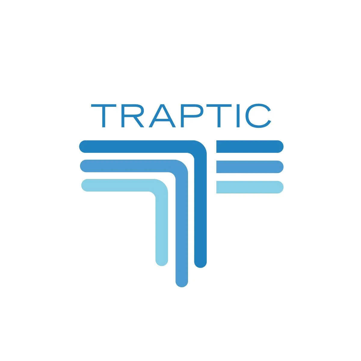
Traptic
The Traptic logo was designed around the letter “T,” forming a bold and recognizable mark at the center of the brand. Its shape also represents the precision and structure of crop rows when viewed from above, tying directly to the company’s agricultural technology focus. This dual meaning creates both a strong typographic symbol and a visual metaphor for the fields their work is rooted in. The result is a logo that is simple, memorable, and deeply connected to the industry it serves.
North Tahoe Preservation Alliance
The North Tahoe Preservation Alliance logo reflects the natural beauty and balance of the Tahoe region. The bold green triangle symbolizes the surrounding forests, while the layered gray shapes represent the Sierra Nevada mountains. The orange circle evokes the sun rising or setting over the horizon, a reminder of Tahoe’s ever-changing landscape. The mirrored blue below captures the clarity of the lake itself, complete with rounded rock forms that anchor the scene and emphasize the Alliance’s focus on preservation of both land and water.
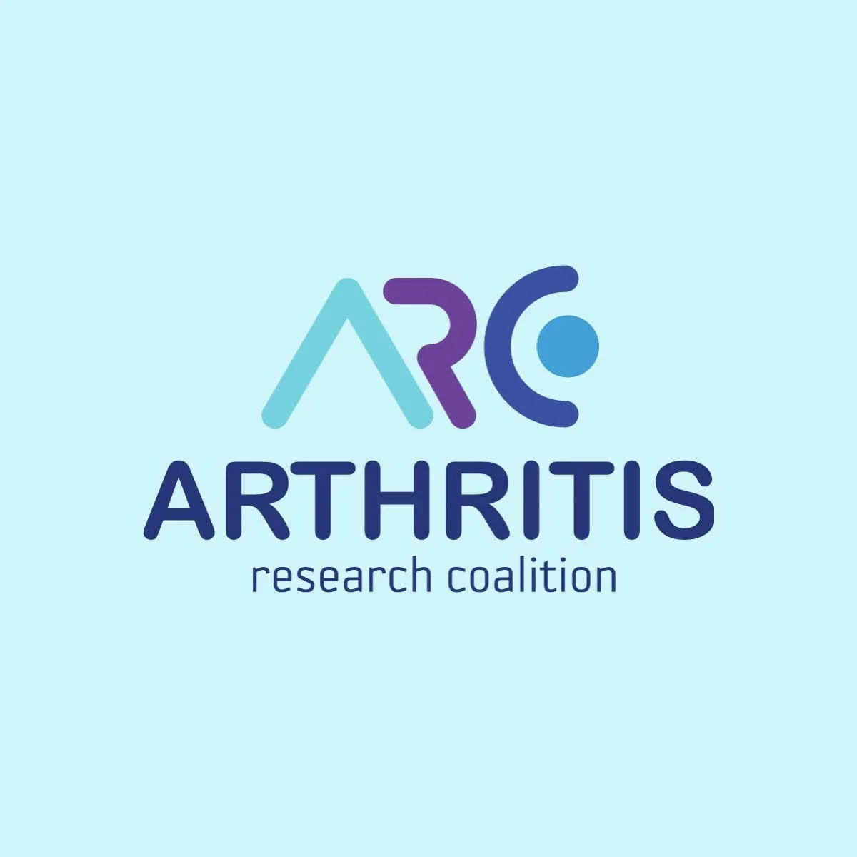
Arthritis Research Coalition
The ARC logo is built around a modern, flowing typographic mark that highlights both innovation and collaboration. The stylized “A,” “R,” and “C” interconnect to form a continuous shape, symbolizing unity within the research community and the coalition’s mission to move forward together. Rounded forms and soft edges convey approachability and care, while the dot element introduces a sense of human presence, representing the individuals whose lives are impacted by arthritis. The gradient blue and purple color palette reinforces trust, health, and progress, making the logo both professional and compassionate.
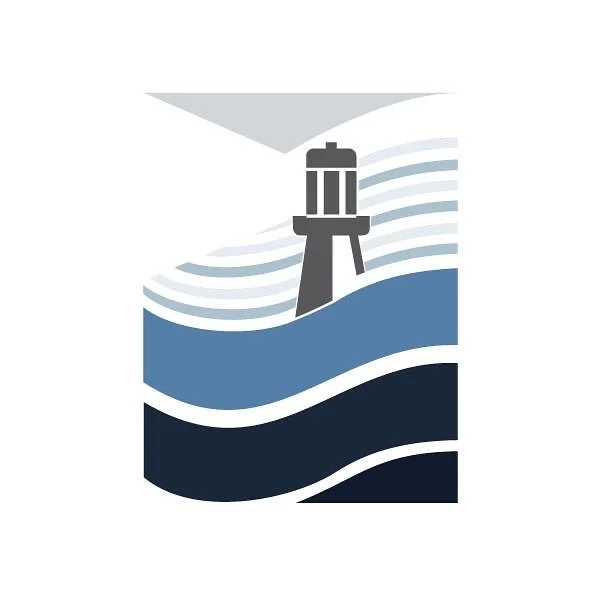
Santa Cruz Life
& Health
The logo uses the lighthouse as a central symbol, representing guidance, protection, and reliability—qualities essential in health and life insurance. Flowing wave forms surround the lighthouse, reflecting the coastal identity of Santa Cruz while also symbolizing stability and continuity through life’s changes. The layered blues convey trust and professionalism, while the upward beam of light communicates hope and security for the future.

Shelley Bennett Skincare
The Shelley Bennett Skincare logo uses a series of concentric white elliptical shapes on a soft sage background to create a mark that feels both refined and approachable. The form suggests an eye or even a crown, tying directly to the brand’s promise of care, confidence, and a touch of royalty. It’s clean, modern, and designed to reflect the elevated experience clients can expect.
Dorothy’s Place
The logo for Dorothy’s Place, a local soup kitchen, combines simplicity with heart. A rustic, hand-stamped red circle frames a white house silhouette, with a heart in place of the door, symbolizing that everyone who walks through is valued and welcome. The distressed font ties it all together, giving the design an authentic, grassroots feel that reflects the organization’s mission of compassion and respect for every individual.
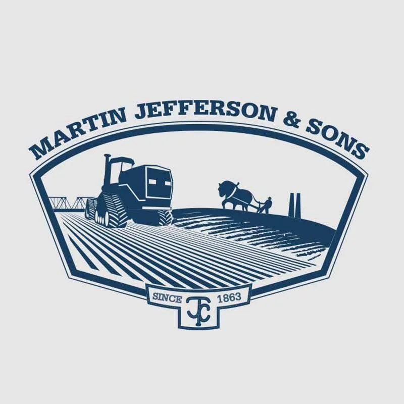
Martin Jefferson
& Sons
The Martin Jefferson & Sons logo tells the story of a fifth-generation farming legacy. Framed in a classic shield shape, it balances past and present—on one side, a modern tractor working clean rows, and on the other, a farmer with a horse-drawn plow. Subtle landmarks in the background ground the design in place, while the “MJ” brand and “Since 1863” reinforce heritage. A simple two-tone palette keeps the mark timeless and strong.