Illustrations & One-Offs
Some of the most fun creative work happens in the margins. This section gathers logos, illustrations, and collateral I’ve designed. Pieces that may be small in scope but carry the same design intention as my larger brand work.
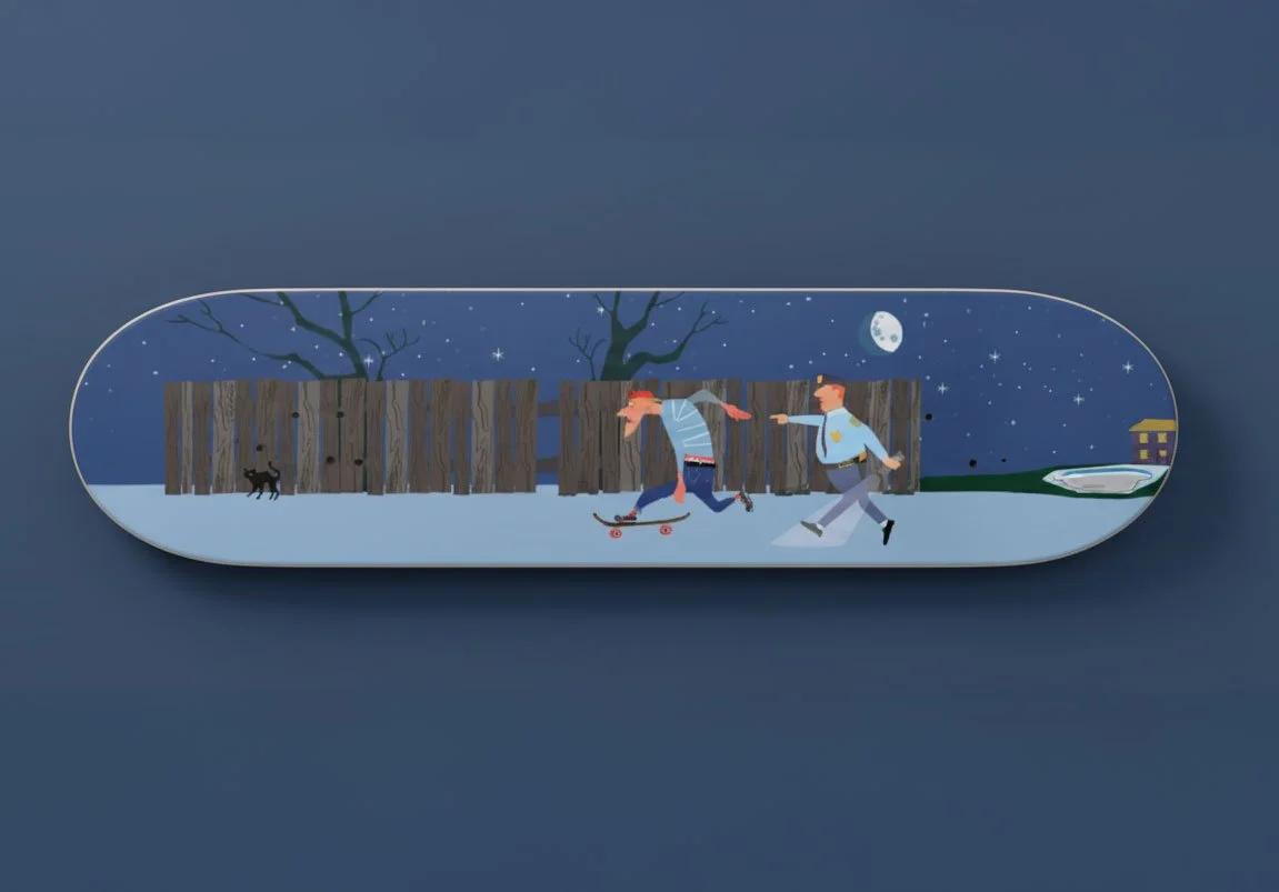
No Cops, No Stops
A cop chasing skater a playful mid-century flat style, inspired by 1950s children’s books. The shapes are bold and simplified, with clean lines and minimal shading, echoing the print techniques of the era. The color palette is muted yet punchy, leaning on retro tones like mustard yellow, faded teal, and warm red. The exaggerated, almost cartoonish movement gives the piece a sense of humor and whimsy, as if the runaway keyboard has taken on a life of its own. It feels nostalgic and lighthearted, capturing the charm of vintage storybook art while bringing a quirky modern twist.

Echo of the Timberline
This illustration of a bugling elk was created in a bold vector style for Grit Knives. Clean, geometric lines and sharp detailing give it a modern edge, while the strong stance and open call capture the raw power of the animal. The design reflects both grit and wilderness, tying perfectly to the brand’s rugged identity and outdoor roots.
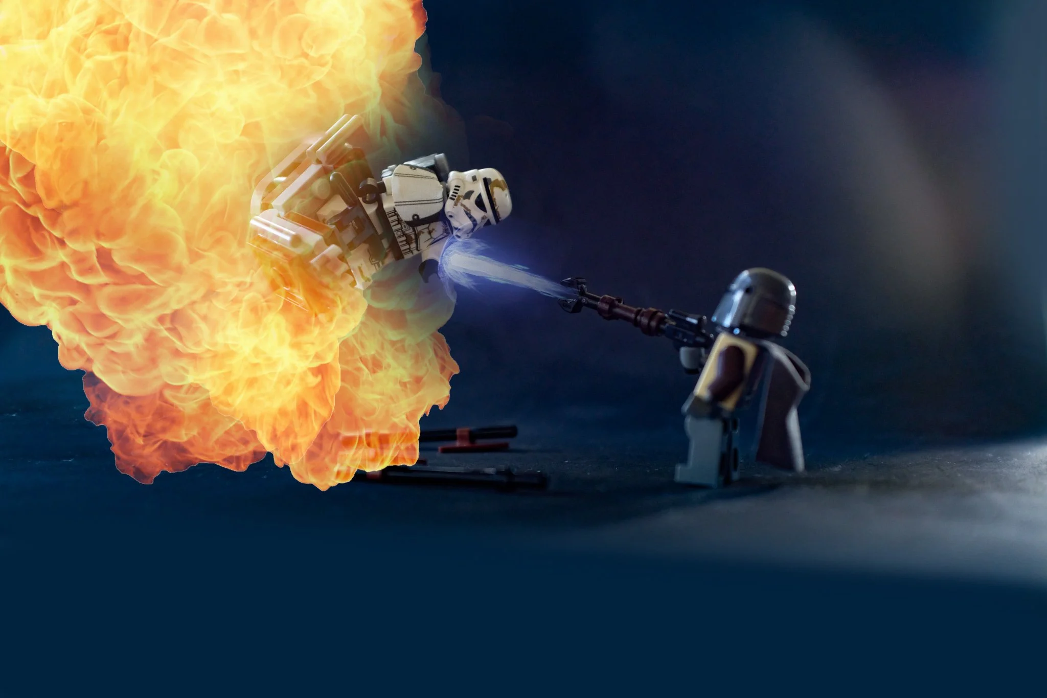


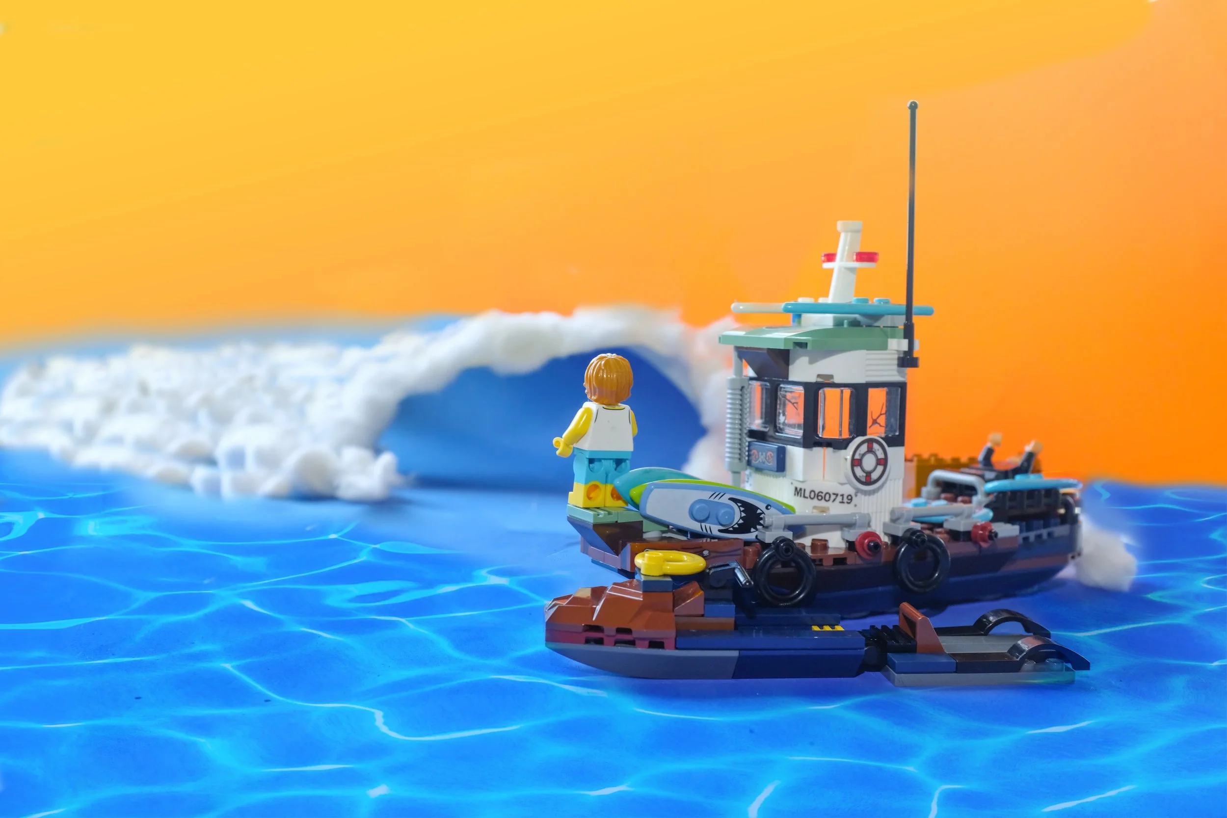
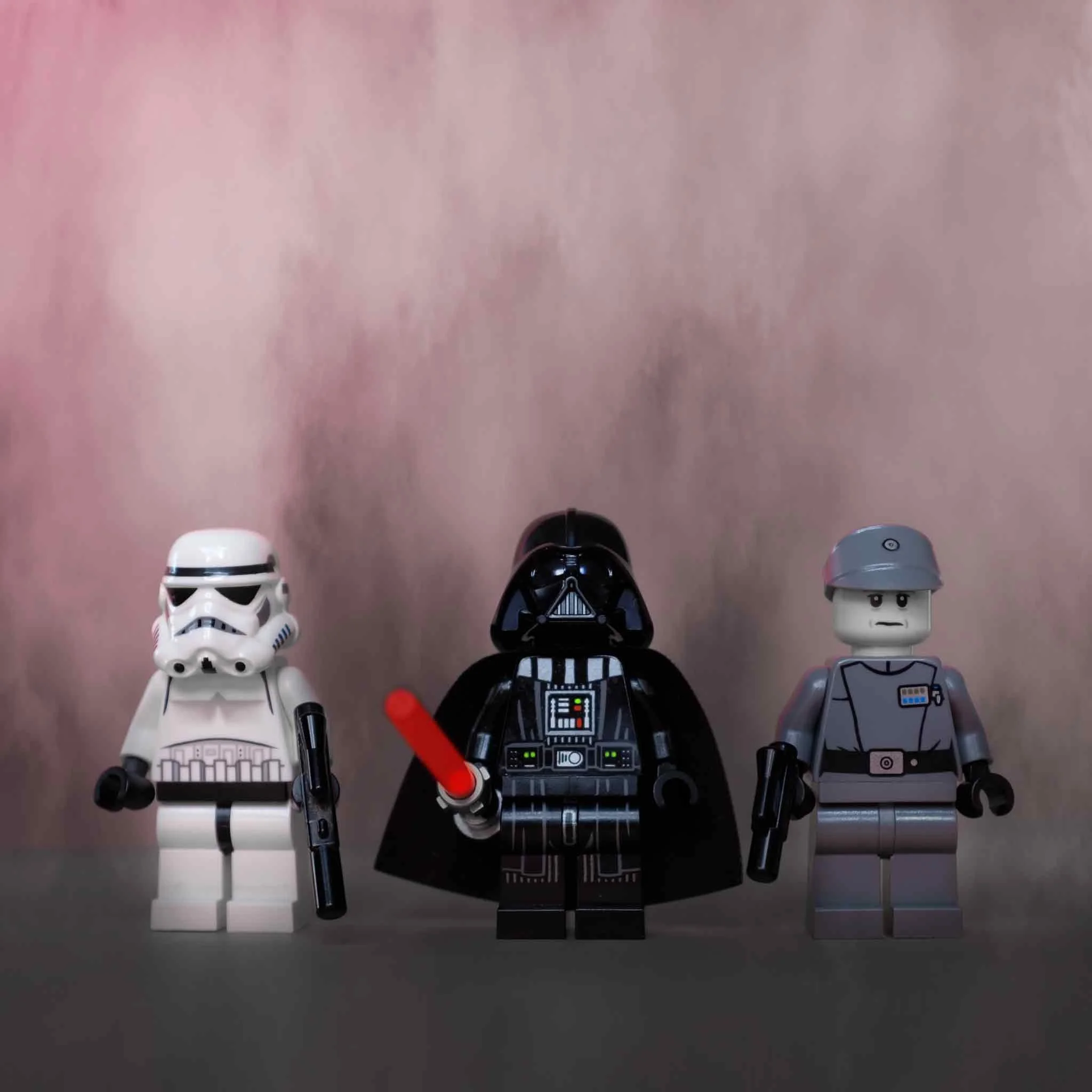
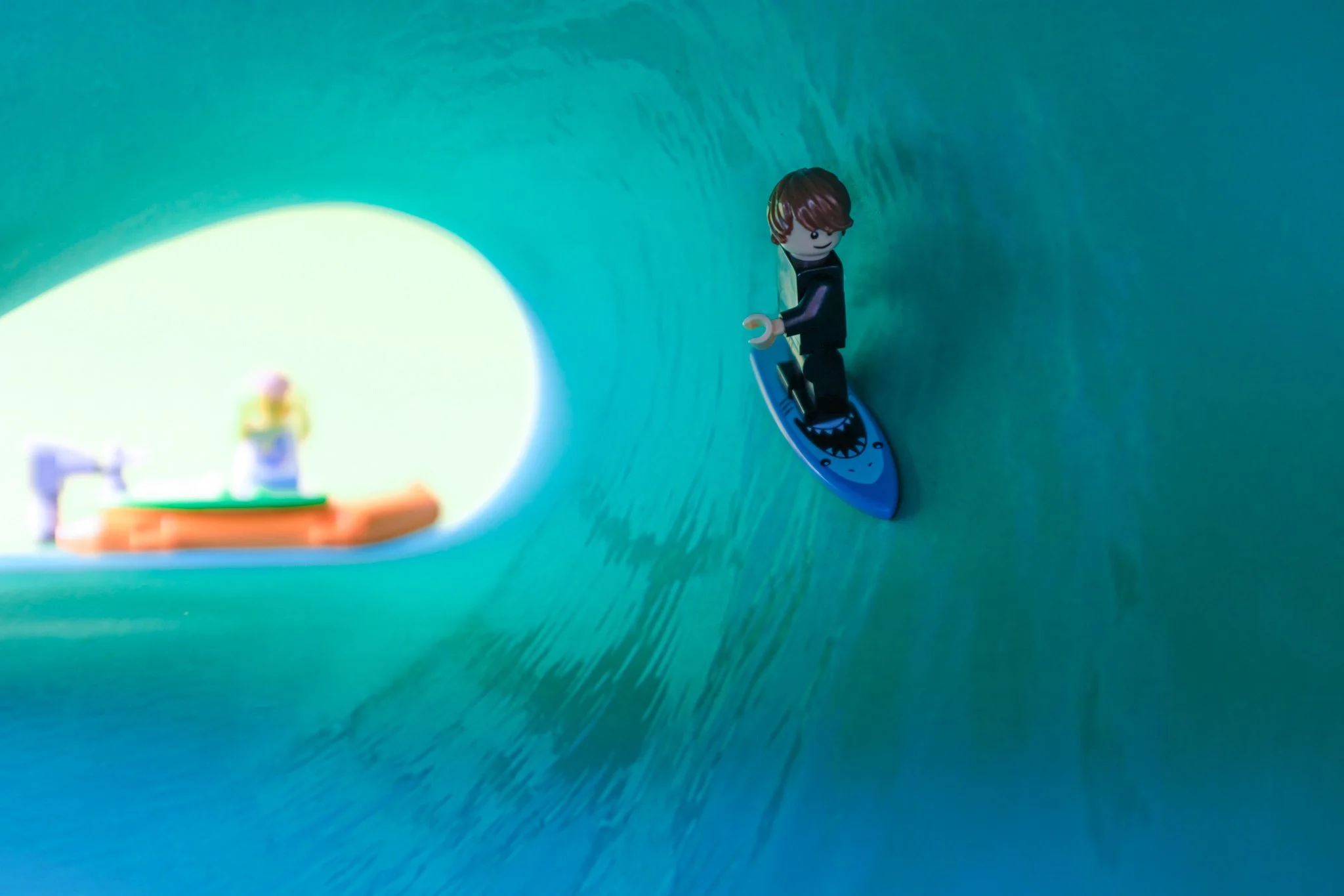

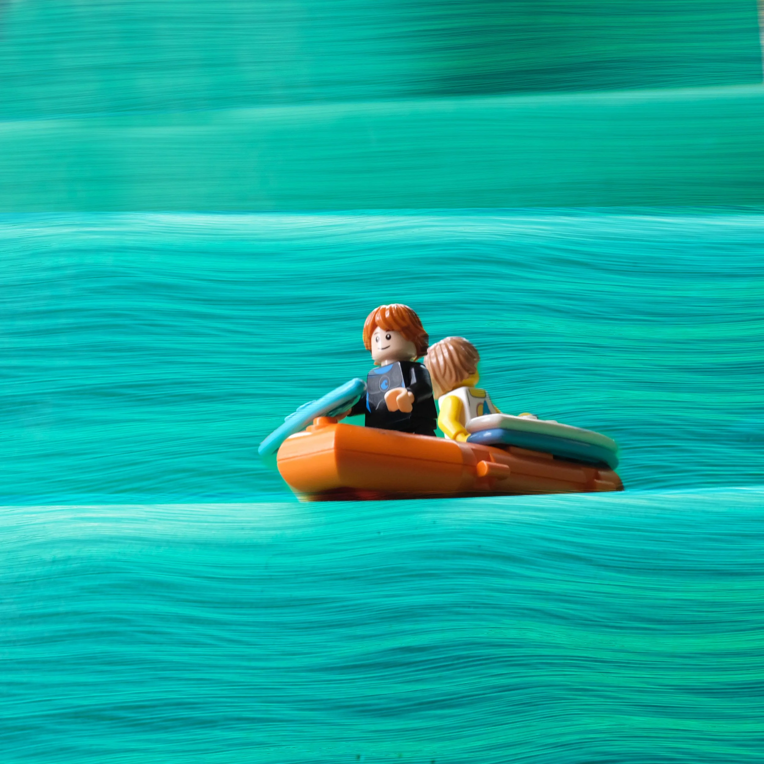
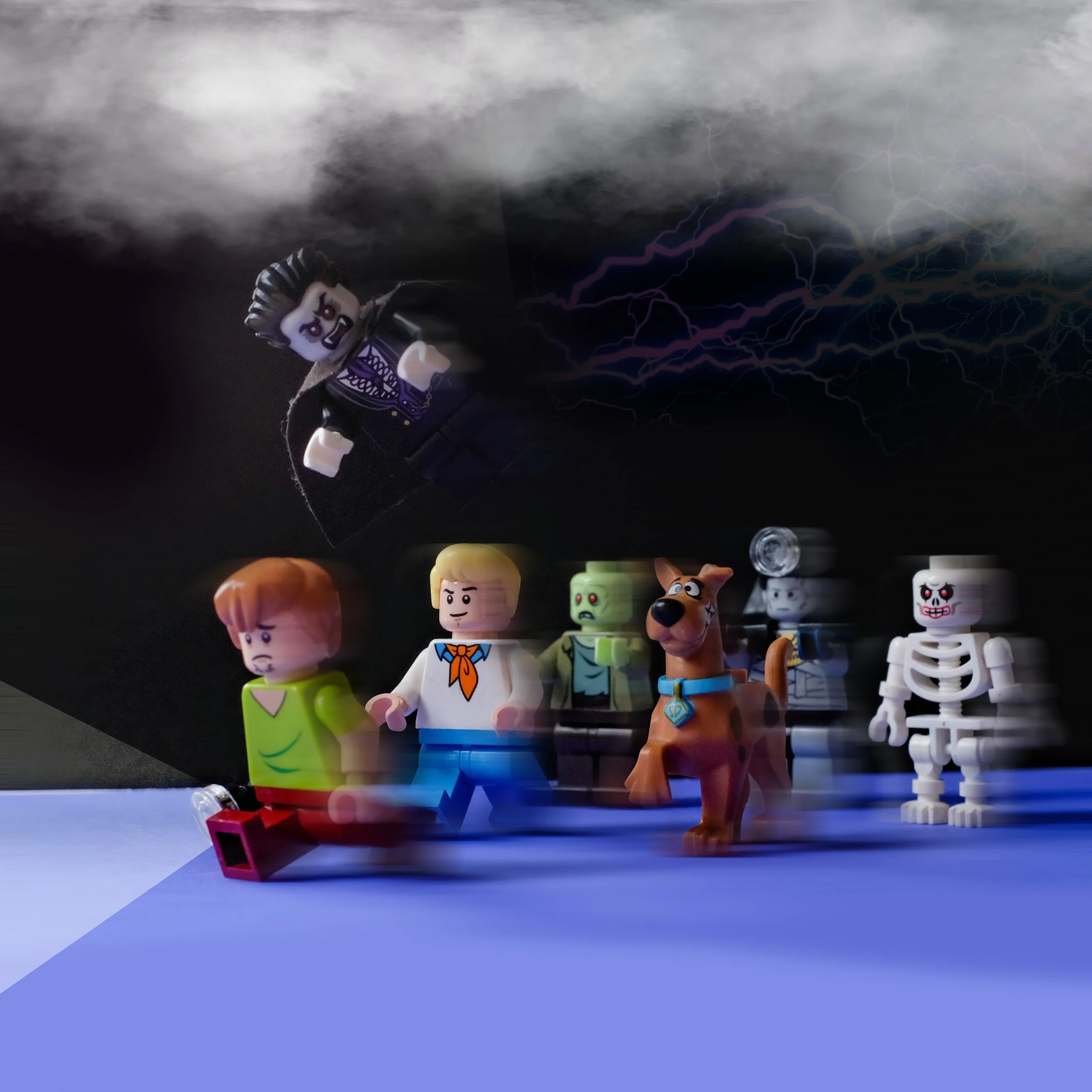


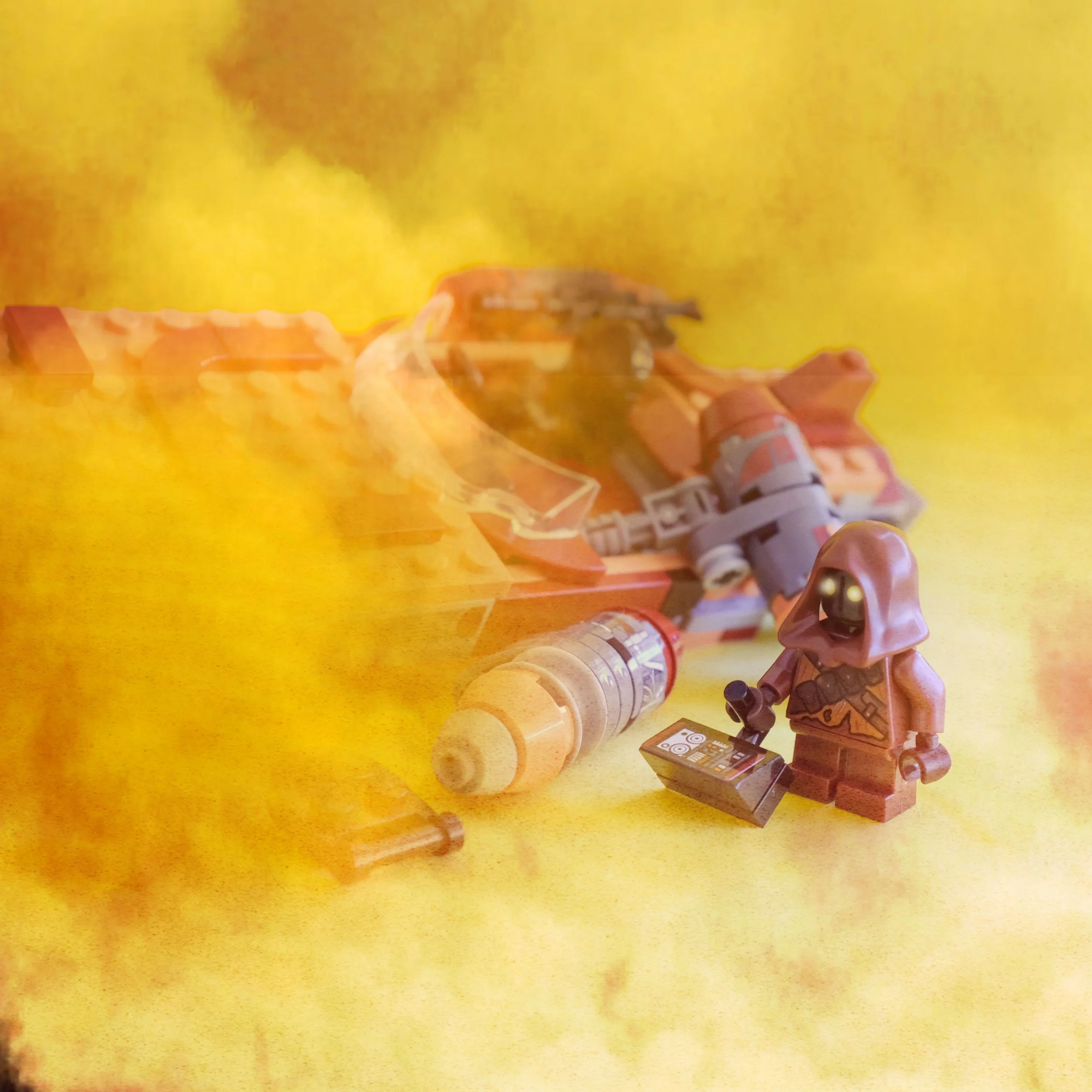
Brick Stories
I created a series of illustrated Lego scenes that blend pop culture and lifestyle into playful narratives. From Star Wars battles to California surf culture and classic skateboarding moments, each piece reimagines the iconic bricks with bold color, humor, and detail. The result is a collection that feels both nostalgic and fresh, celebrating the creativity and storytelling power of Lego.
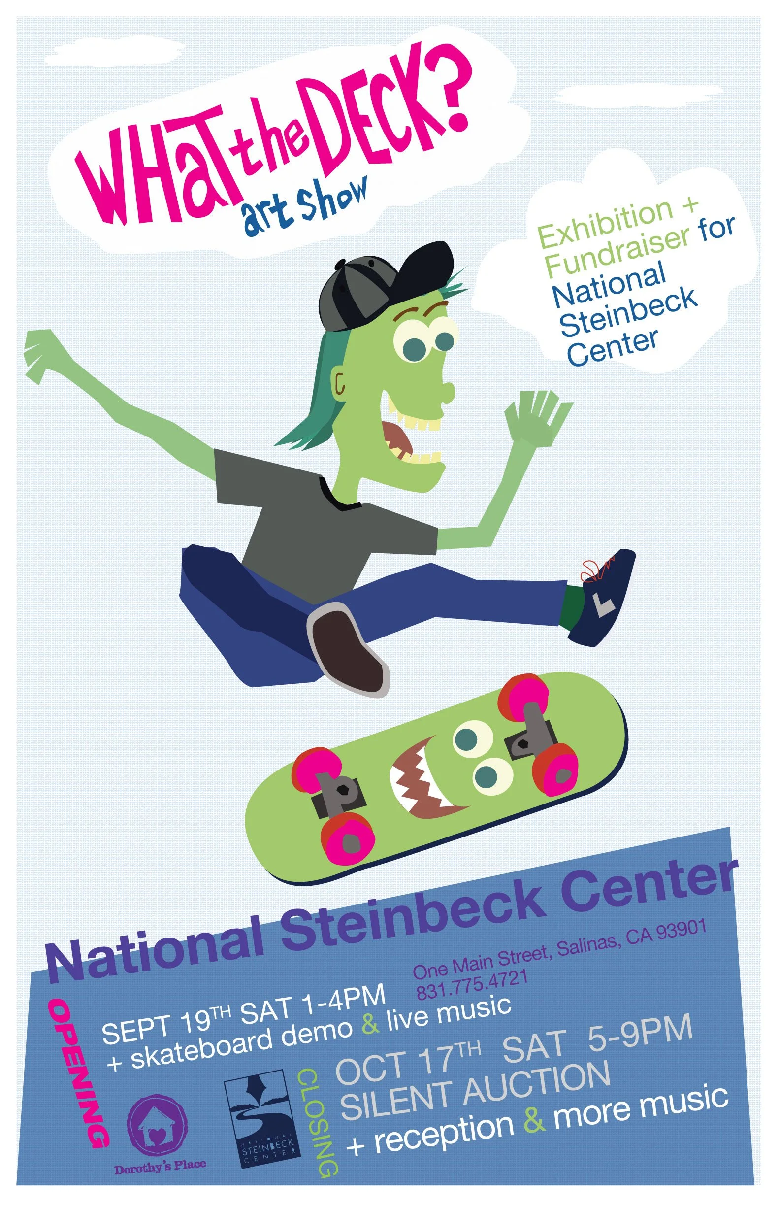
What the Deck
For Dorothy’s Place, I organized What the Deck, a nonprofit benefit built around 100 blank skateboards generously donated through a Sappi grant. Local artists transformed the decks into one-of-a-kind pieces, which were exhibited at the Steinbeck Center and auctioned off to raise more than $13,000 for the organization. The project not only raised critical funds but also brought together art, community, and skate culture in an unexpected way. The poster for the event was illustrated in a bold, flat 1960s Weird-Ohs–inspired style, perfectly capturing the playful spirit of the show.
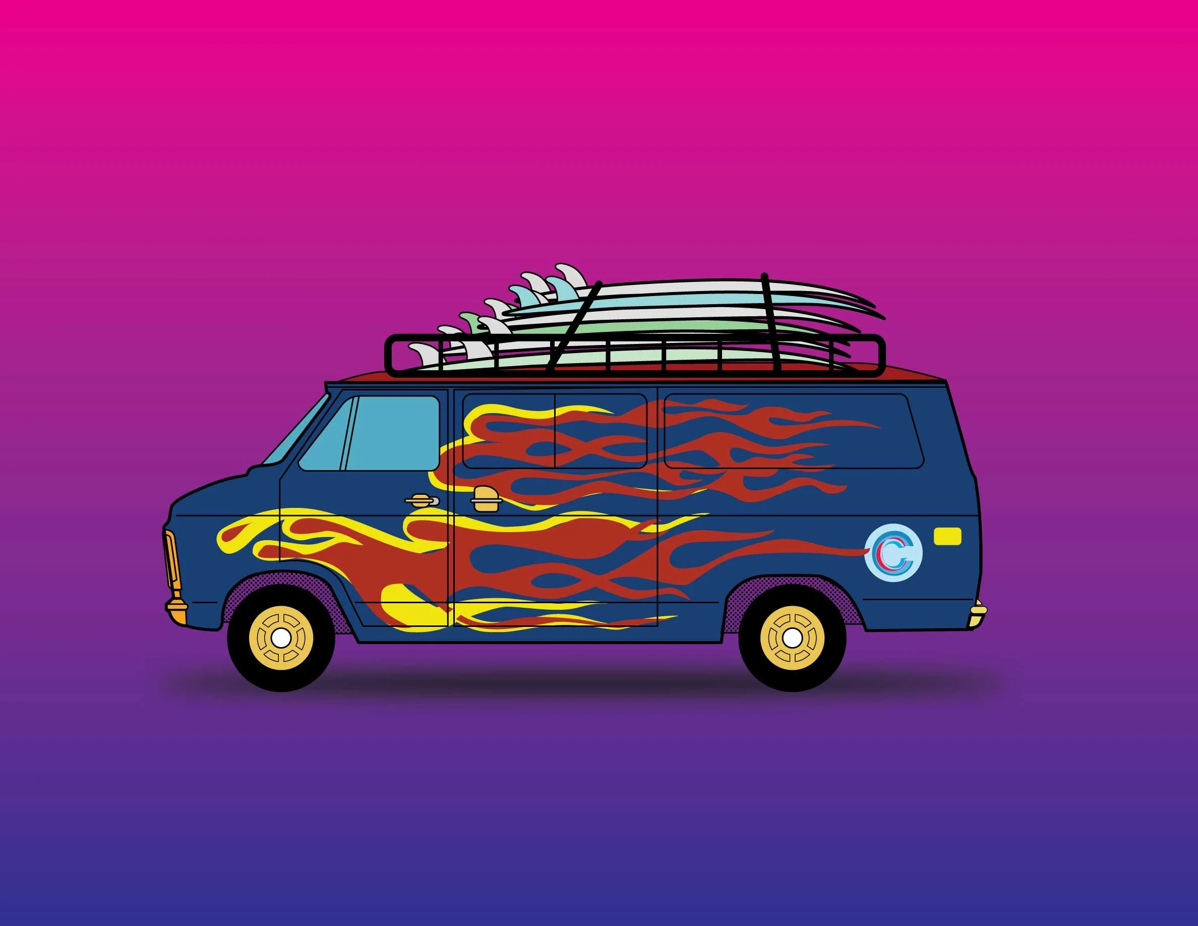
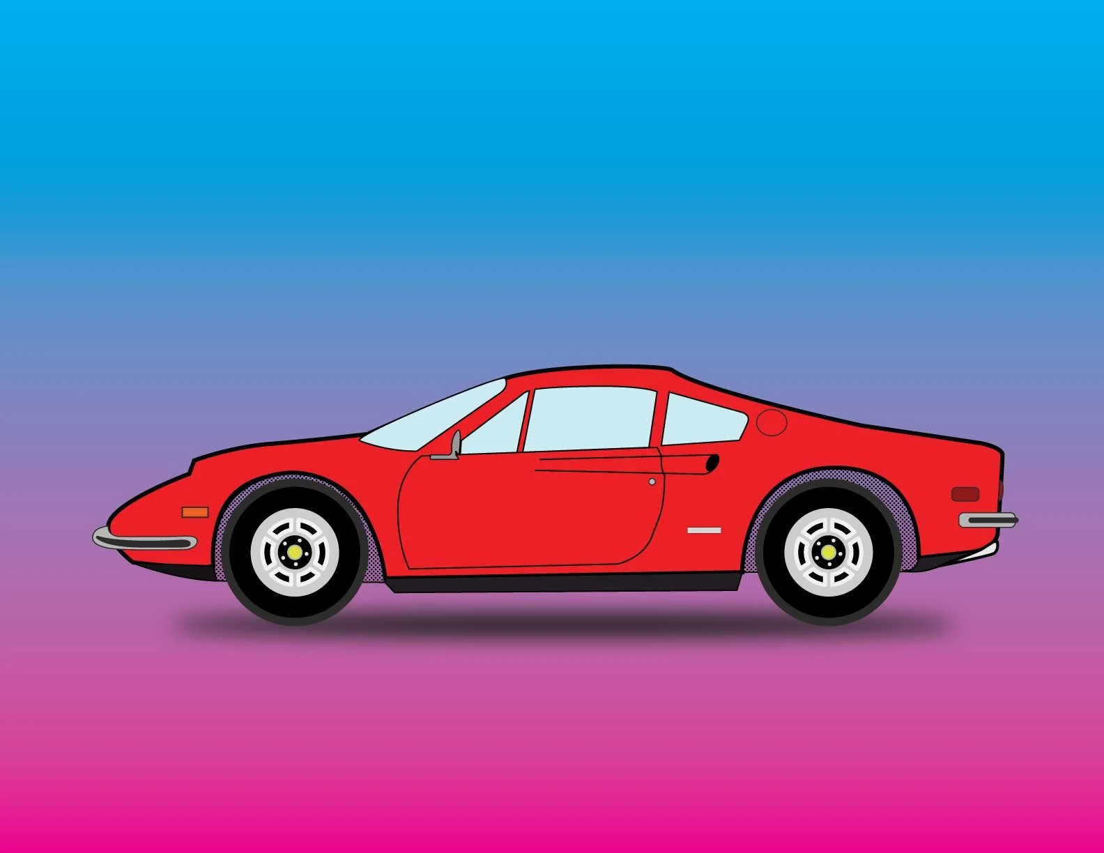
Wheels of the ’70s
This illustration captures two icons of the road in a flat, mid-century–inspired style: a sleek 1972 Ferrari Dino and a classic 70s van stacked high with surfboards. The bold lines, simplified forms, and retro color palette celebrate the contrast between luxury performance and laid-back surf culture. It’s a playful snapshot of an era where cars weren’t just transportation.
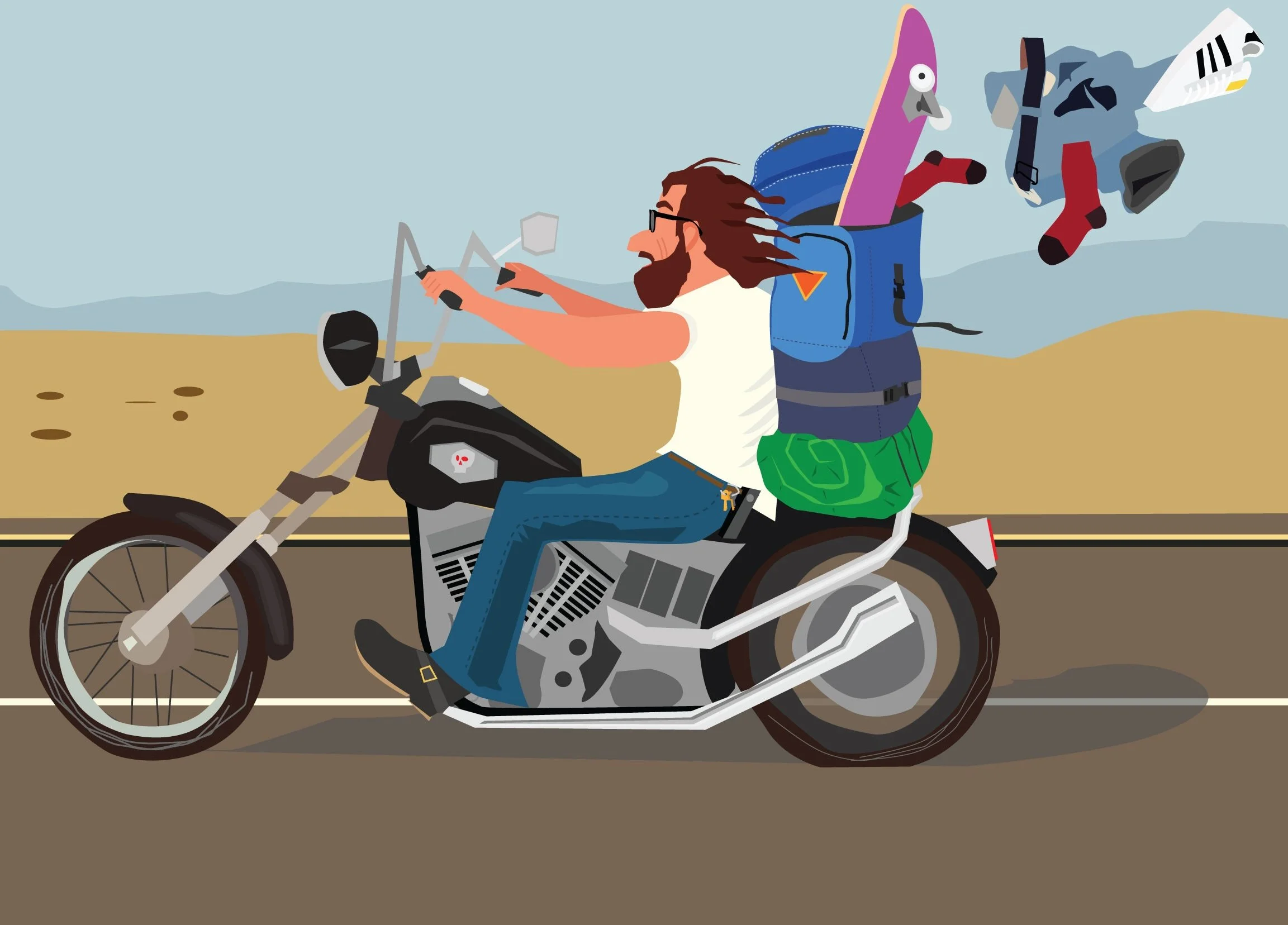
Easy Rider Redux
a biker on a Harley, flying down the highway in a mid-century flat style inspired by 1950s children’s books. He’s riding without a helmet, Easy Rider–style, with a backpack spilling its contents into the wind. Bold, simplified shapes and a retro color palette capture both the humor and freedom of the scene, giving it a playful yet rebellious edge.