The Stamp That Fed Thousands: The Art and Impact of Dorothy’s Place
Every once in a while, a project lands in your lap that reminds you why you got into design in the first place. Dorothy’s Place was that project for me.
Back in the day, this little soup kitchen in Salinas was doing incredible work. Feeding and caring for the less fortunate, all while running on pure heart and hustle. They didn’t have a big budget or fancy branding. What they had was grit, compassion, and a deep belief in community. That’s where I came in.
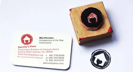
The Original Rubber Stamp
The logo for Dorothy’s Place started as something tactile and raw. A rubber stamp I carved and pressed by hand. The circle wasn’t perfect, and that was the point. The heart-in-a-house mark captured the warmth, imperfection, and humanity of what Dorothy’s stood for. Later, I vectorized it so it could live beyond ink and paper, but I’ll always remember the first impressions made with that stamp. Each one a little different, each one authentic.
One of my favorite Designers, Michael Osborne, played a big part in inspiring this. He’s one of those designers whose advice sticks with you, and he’s the one who pointed me toward the Sappi Grant program. I applied , and we won. Thirty-two thousand dollars went straight to Dorothy’s Place, helping fund their mission and keep those doors open.
I’ve done hundreds of logos since then, but few have stayed with me like this one. Maybe because it wasn’t just about design. It was about doing something that mattered . Using creativity as a force for good. Every time I see that logo, I’m reminded that great design doesn’t just sell products. It can change lives.
That’s the real reward.
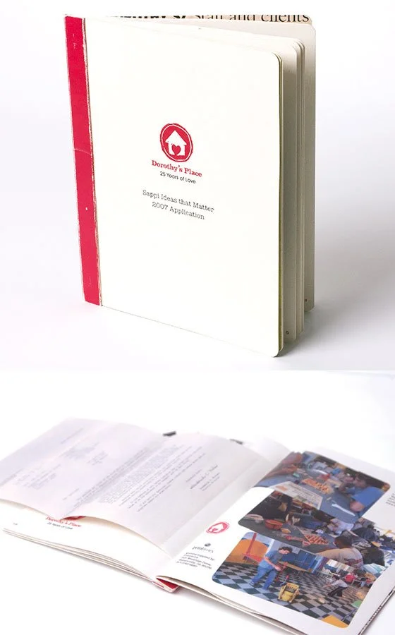
The Grant submitted to Sappi